← Back
Graphics
Crowders Camps Rebrand
A full brand identity overhaul for Crowders Camps, refreshing the logo system with property-specific marks, updated typography, and a cohesive visual language across all camp locations.
Old
New
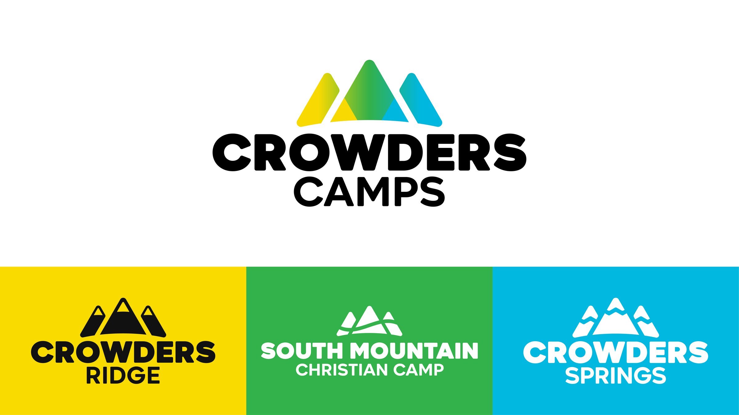
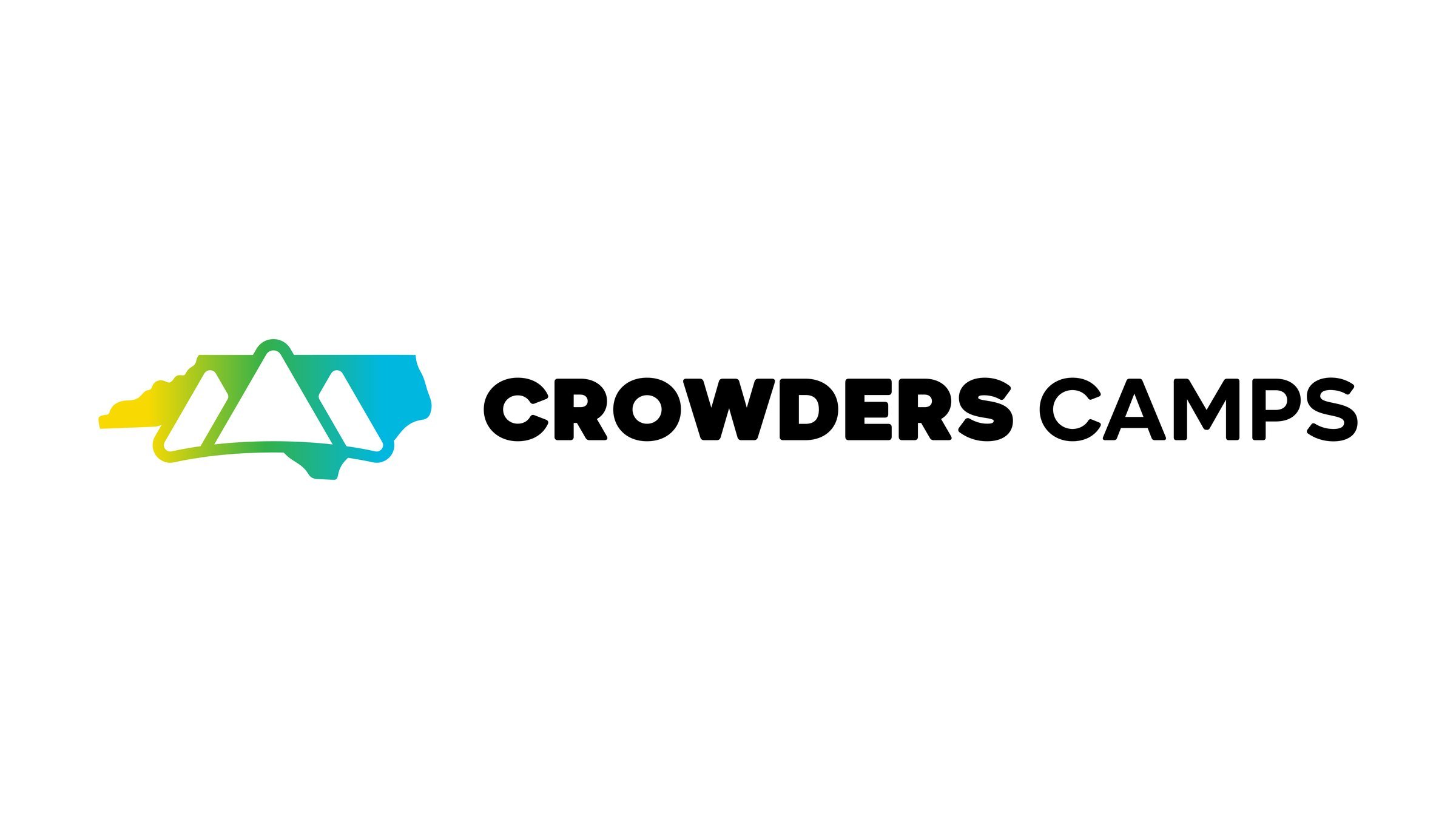
Logo System
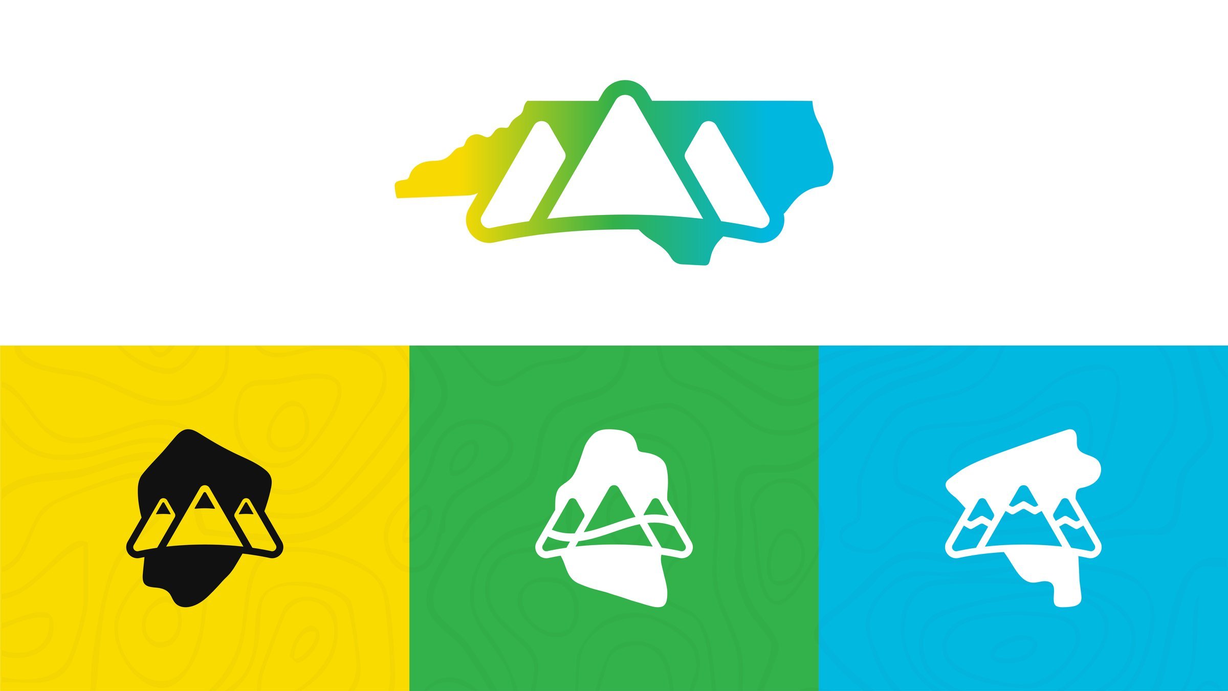
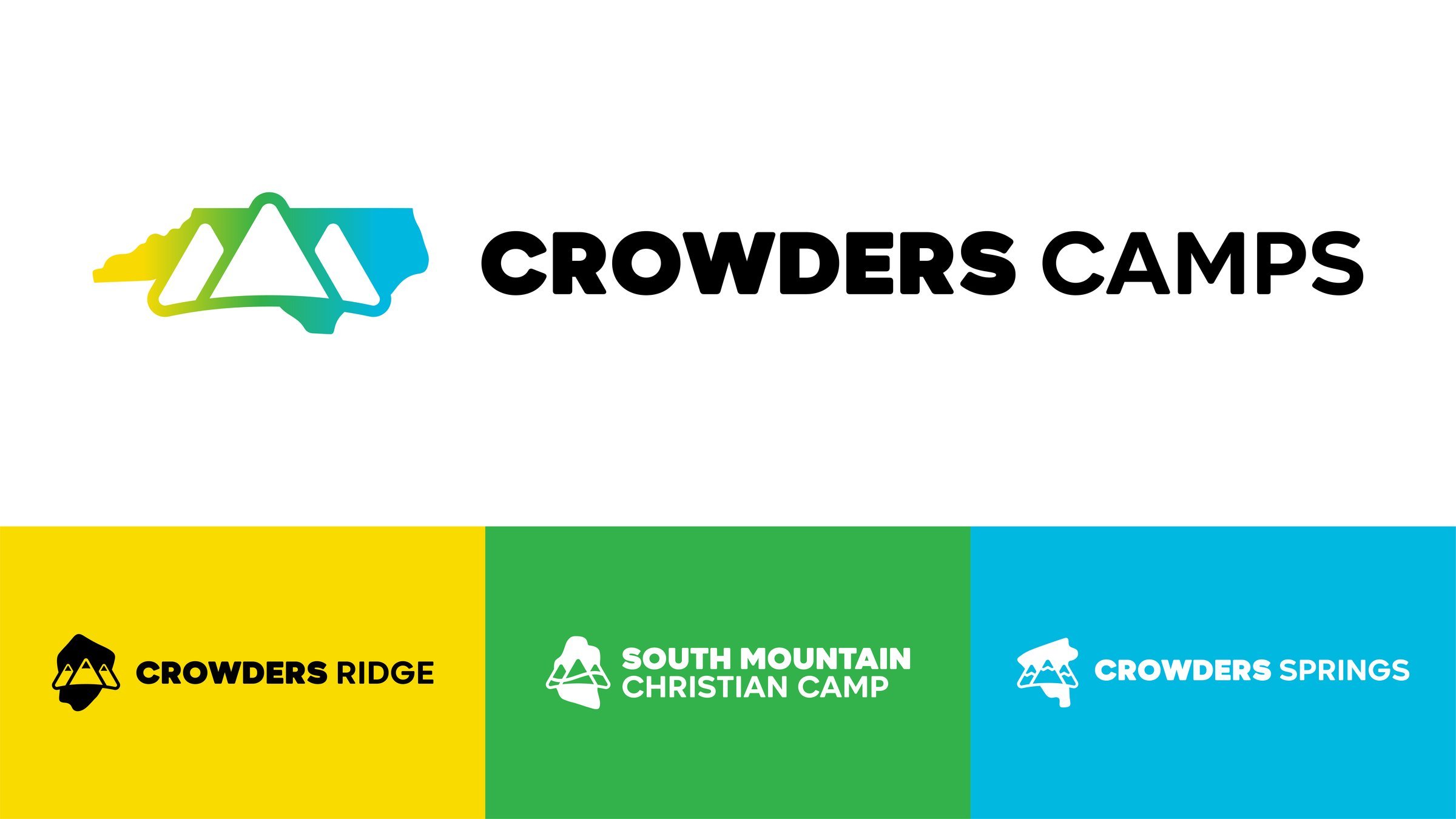
Alt Logos
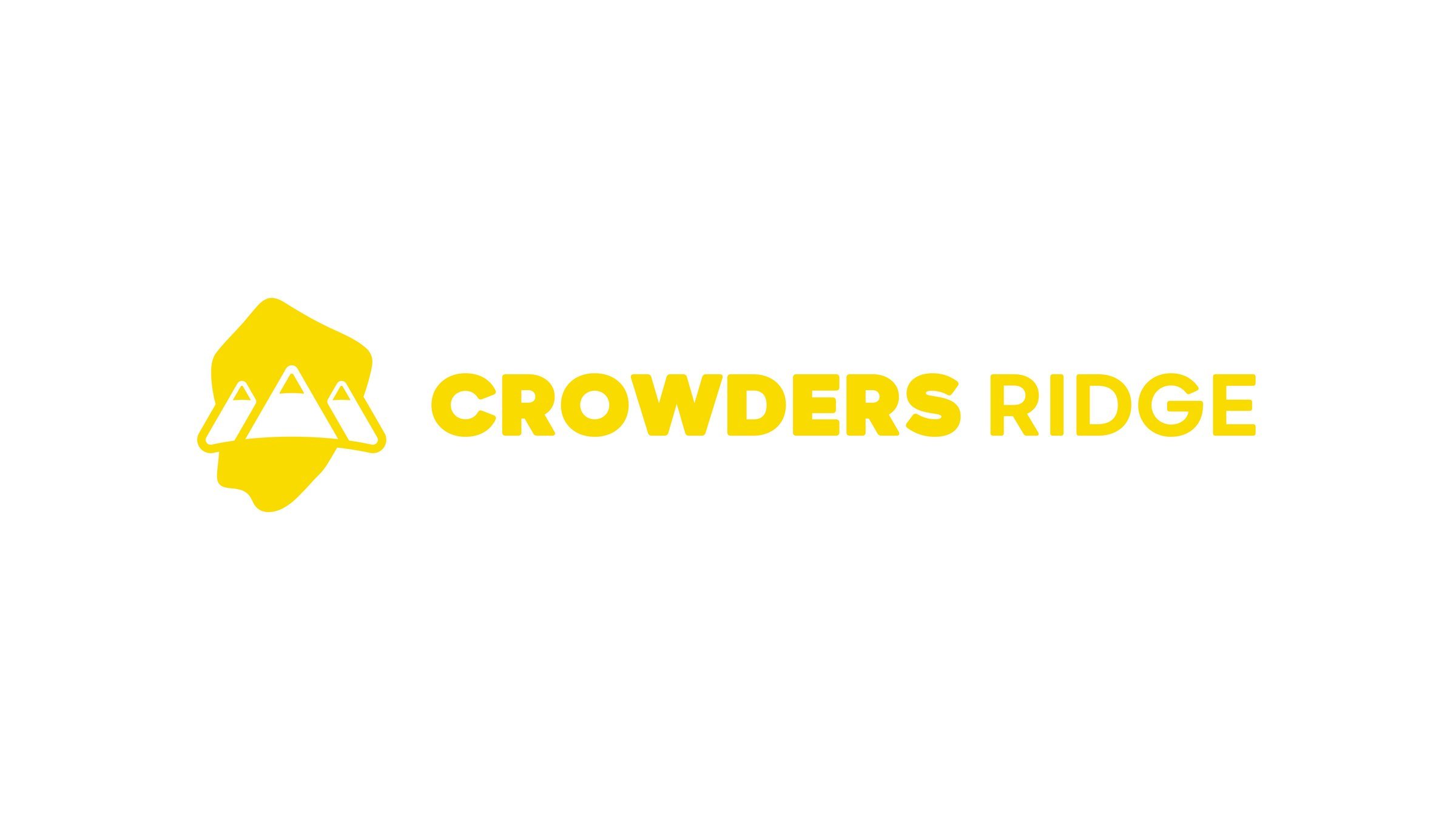
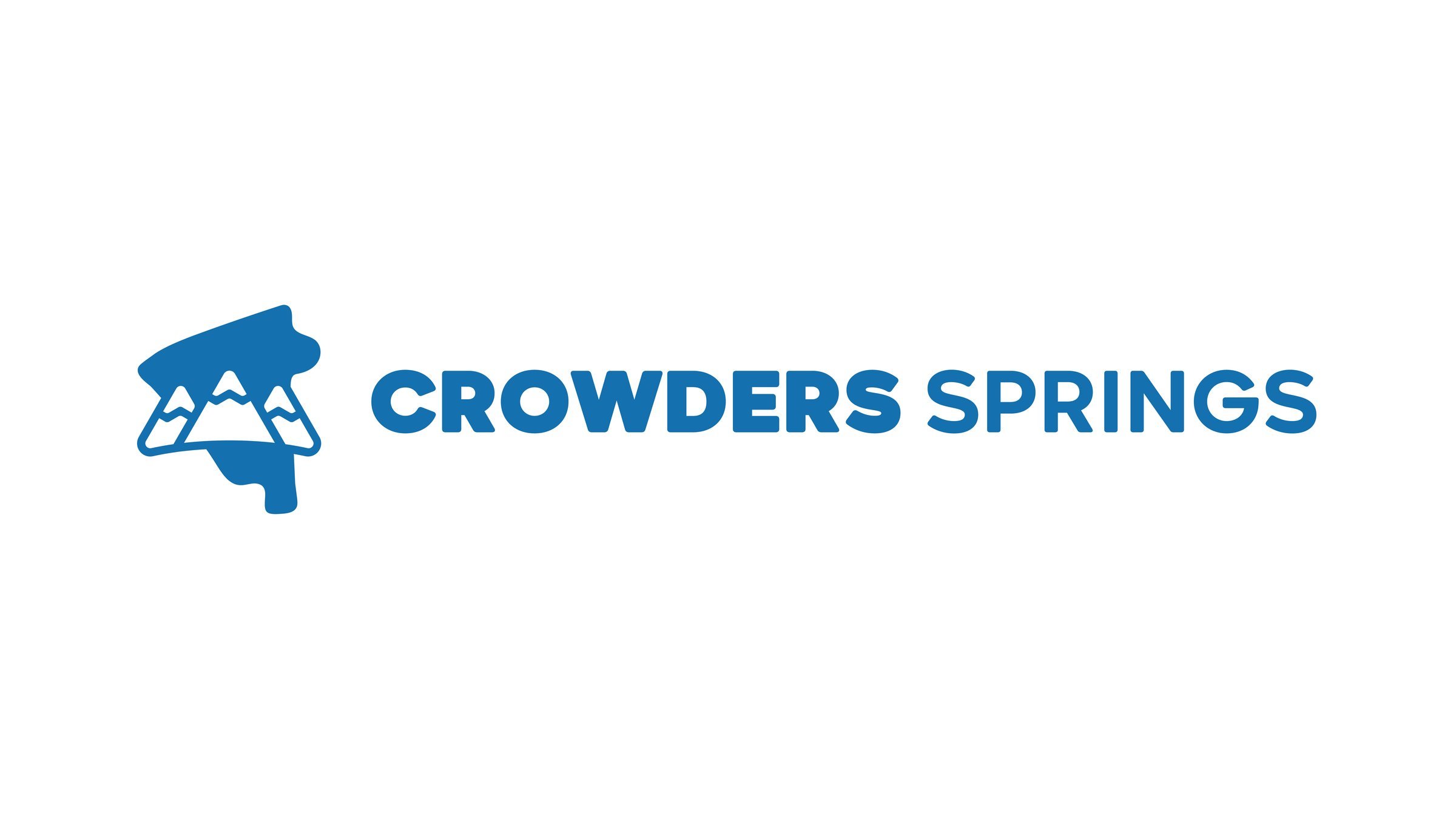
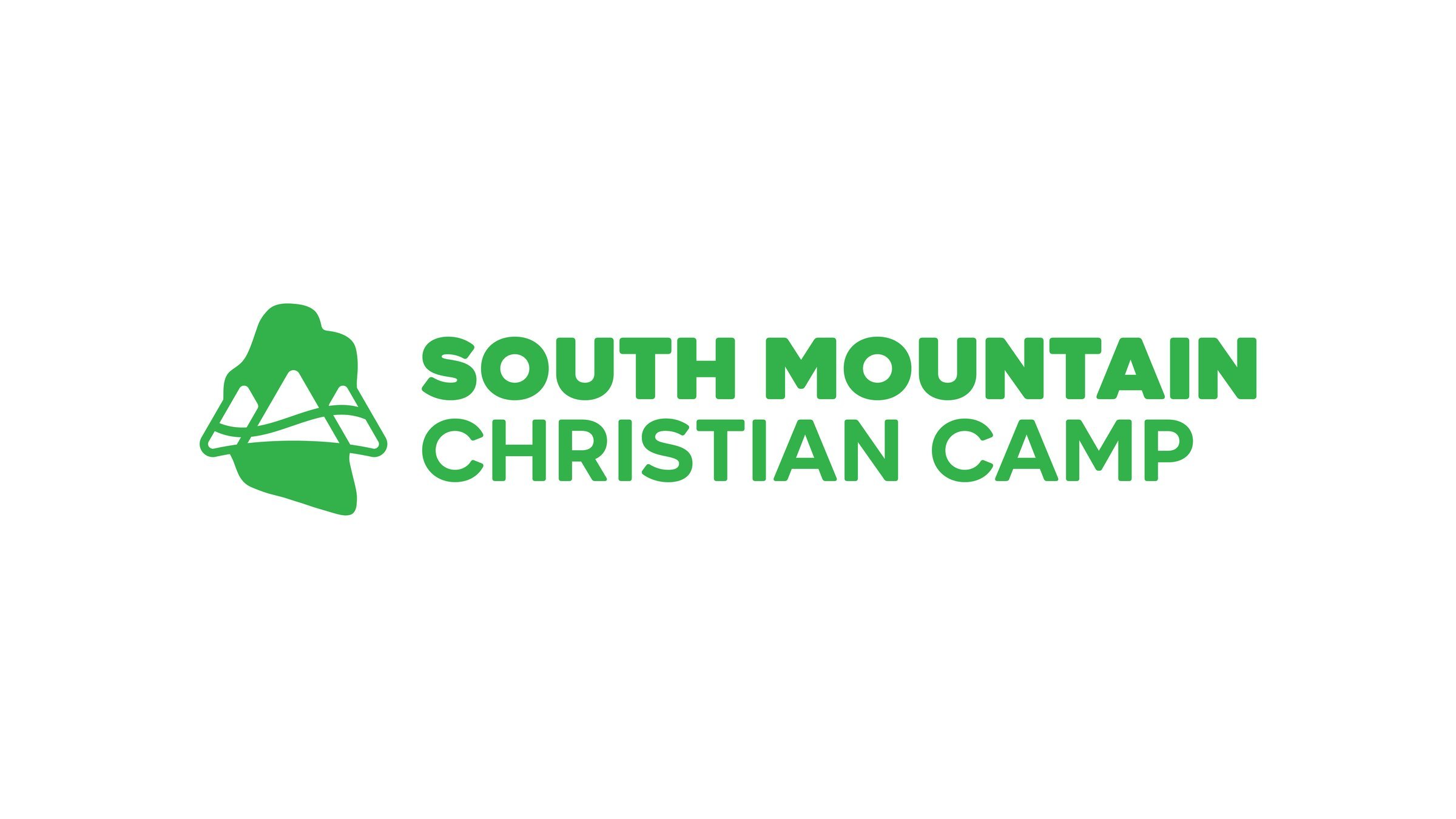
Each property logo is more than just a mark — the shape of every icon is drawn directly from the physical landscape of the camp itself. Whether it's a ridgeline, a body of water, or the contour of the land, every logo is a visual reflection of where you are.
Typography
The primary typeface used throughout this rebrand is AftikaSoft. Its rounded letterforms and approachable character naturally reflect the warmth and energy of the camp environment — bold enough to command attention, friendly enough to feel right at home in the woods.
Brand Colors
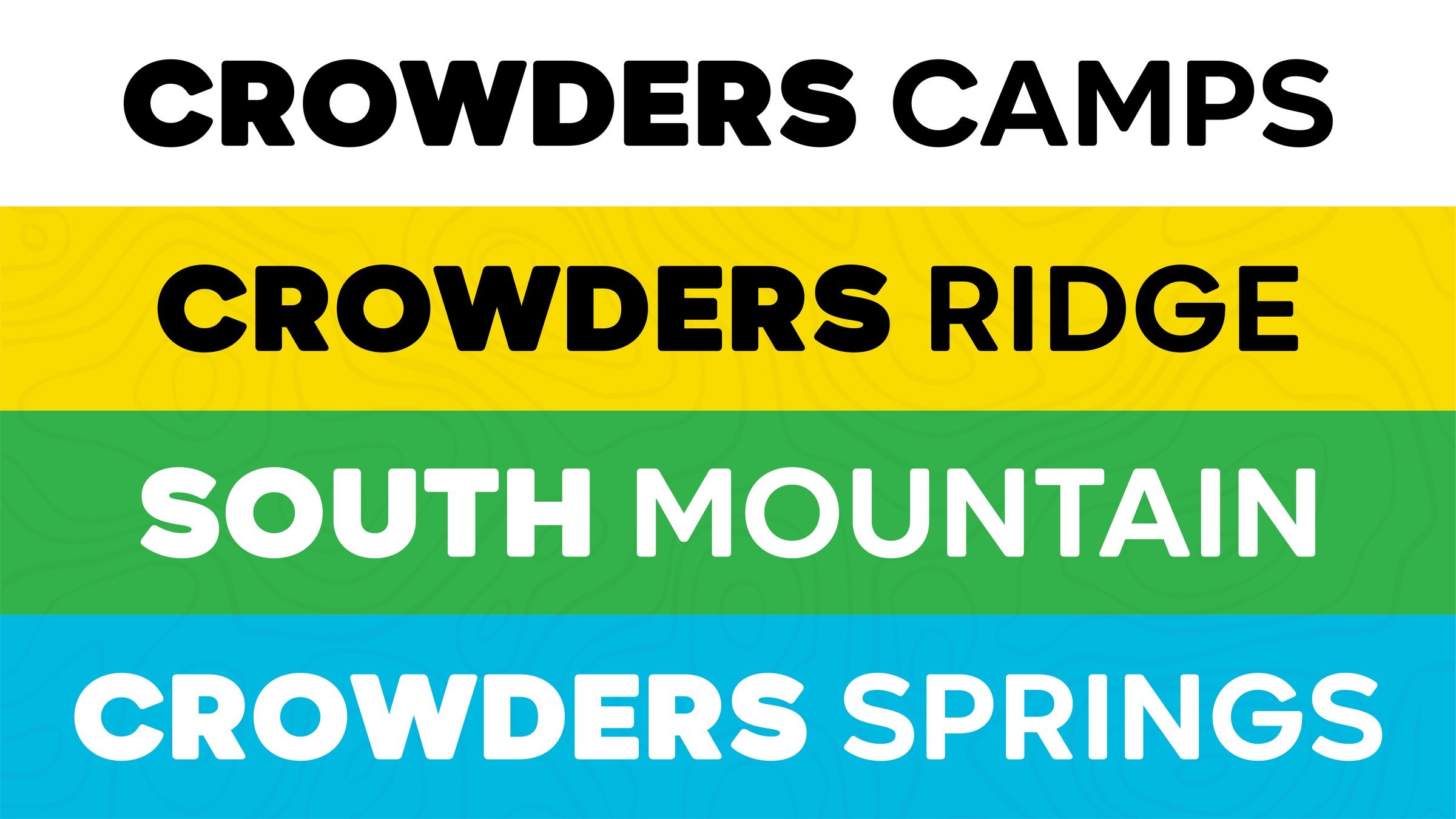
Crowders Camps
#F9DB00
#32B24A
#01B8E1
Crowders Ridge
#F9DB00
#111111
South Mountain
#32B24A
#FFFFFF
Crowders Springs
#01B8E1
#1470AF
#FFFFFF